design blitz!

Unfortunately, I didn’t go out much this week, and our trip to DC was quick, so I didn’t have time to stop and take very many pictures. So, of course, lets start out with the first picture!
The first picture is what I’ll be using as an example for typography, and a little bit of color! As Typography for Lawyers puts it, it is the visual component of the written word. With typography, it’s important to know it’s trying to achieve. For my example, I took a picture of Grimace’s new meal, which has text on the cup and other parts of the meal.
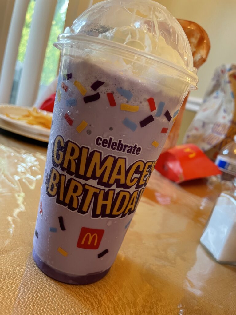
We can see that the focus of this design is meant to be on the part that reads “Grimace’s Birthday”. This is due to the fact that the letters are larger as compared to the smaller “celebrate” portion, and is also entirely in capital letters. Another part of this design that I thought worked was the way the letters are placed. They aren’t aligned, which helps give the design a more fun feeling, as Grimace’s birthday is not meant to be serious. The color choices also captures the attention of the person viewing it. In Karen Kavett’s Intro to Color Theory video, she talks about the color wheel, and mentions complimentary colors- colors directly opposite of eachother. The Grimace marketing design uses Grimace’s hue- purple- and combines it with the letter color, yellow. This is an example of the use of complimentary colors. The fact that the shake itself is purple helps the letters stand out, as well.
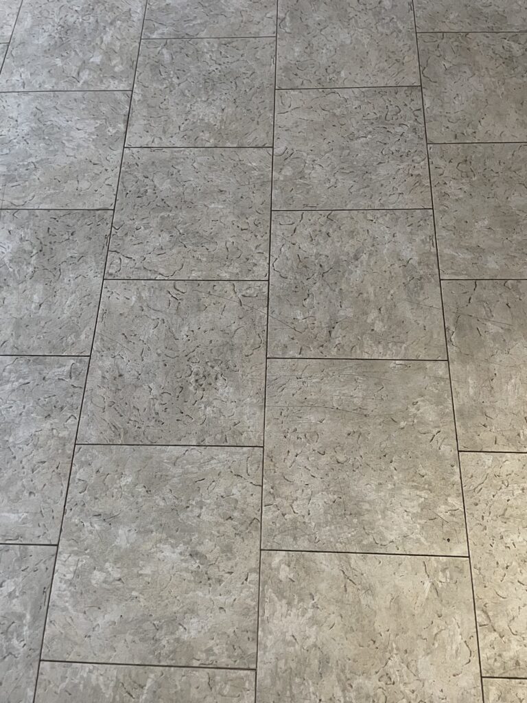
The second image I took I will be using as an example of rhythm. As Write Design Online says, rhythm can create a sense of movement, and establish a pattern or texture. For my example, I took a picture of a floor I felt showed a strong sense of rhythm.
This floor looks fairly walkable! The rhythm on this image feels weaker near the bottom of the image, and gets stronger near the top. While I don’t think it was on purpose, it does give this image a bit of progressive rhythm. However, I do believe it was meant to be more of a pattern repeating on each of the tiles. If you look more at the placing of the tiles, you do geat to see more of a repeating pattern. I took this image because I think the rhythm on the tiles helps establish a strong texture, as the definition on Write Design Online states.
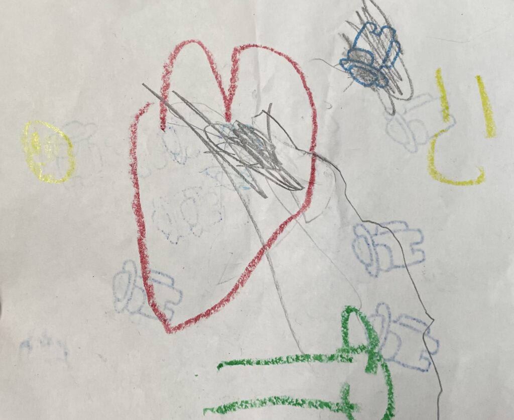
The third image I took is a little less serious than the other two- it’s a drawing a six year old drew me. I probably shouldn’t be judging it too harshly, after all, they’re only getting started on their design journey, but I thought it’d be fun to use it as an example for the form, function, and message. There were no articles for the definition of this one, but I think it’s pretty straight forward. Does the design get across the message it wants to get across?

When you look at this, what do you get from it? It’s a little heard to tell, right? Of course, I saw a lot of heart and soul put into this, but if this was meant to share a clear message, would you understand it? If I didn’t know what it meant, I would think it might have been about a broken heart being healed by friendship and smiles (and an Among Us stamp?). However, it was really just supposed to show how much they loved me! If we wanted to turn this design into a stronger message that implied that, I think a simple step would be to remove the pencil markings. The choice of color with the pencil marking contrasts with the brighter crayon markings, making it seem like a bad thing.
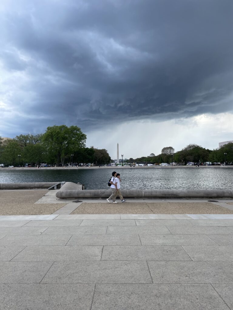
The last image was a picture I took in DC. I’m going to use it as an example for dominance. As Vanseo Design puts it, it’s when some elements command attention over other elements. There should be a focal point (or basically, the place you are meant to look at) in a design, and that is the dominant part.

I’m gonna judge my own picture here! To be honest, I’m not entirely sure what the focal point is. I wanted it to be the Washington Monument, but I do believe it ended up being the two people walking in front. They seem to be the dominant part- the fact that they’re moving, the way the water contrasts with their figures, and the way the monument itself sort of pulls you down towards them. I think with a little more work, I’d be able to make the monument more of the dominant image here. Maybe if the two people walking weren’t there, it would have read better.